
Foster the City Pt 1: Sending and Receiving Requests

An 8-year vision brought to life in 8 months.
V0: Nov 2022 - Apr 2023
V1.0: Jun 2023 - Aug 2023
Role: Product Designer, Project Manager, Product Manager, Design Sprint Facilitator, User Researcher
Wonder & Wander Team
Foster the City: Philip, Kylie, Darren
For V1: Yalantis (agency)
Problem Statement
Volunteers are dissatisfied with Foster the City due to lack of consistent processes and unclear expectations.
Foster the City works by partnering with churches and planting a ministry at that church with Advocates, Support Friends, and Foster Parents. Each ministry had their own way of doing things using their own toolbox: Google Calendar, email, Google Sheets, Excel—you name it. Over time, this resulted in pain points for everyone.
To add to that, the application and volunteer onboarding process was only visible to a handful of staff in the center of the organization, which caused people to feel lost in the process.
They came to us (Wonder & Wander) to help them build an app to streamline the onboarding and the coordination between each ministry. For the sake of simplicity, this case study will focus on the team and calendar request feature.
Approach
Foster the City came to us with their own idea of what features they wanted. However, we chose to dive deeper to understand and surface the core problems that each user group was facing so that we could design something that could serve each of them.
Afterwards, we designed the app around the aha moment: when foster parents' requests were successfully fulfilled. This repeated experience would build trust and accountability between every user group in the ecosystem.
Since each role has different needs and responsibilities, we designed a different side of the app for each of them. The final result was a 3-sided app for each user group, tailored to their specific needs, pain points, and goals.

Key Principles
01 | Request with Confidence
We want Foster Parents to make requests with confidence they will be fulfilled by their support team.
02 | Easy to Create
Foster Parents are busy and don't have time to use different tools to make requests or re-enter details of repeating requests.
03 | Team Spirit
It's common for foster parents to feel alone on their journey. We need to cultivate a unified spirit of "we're in this together."
04 | Full Transparency
Without knowing what to expect, Foster Parents and Support Friends feel lost.
Result
We shipped the V0 (core request experience) to Testflight in 3 months with a pilot test group which gave us feedback for revisions, and we shipped V1 (full account creation, core features) 4 months afterwards.
Some nice things people said:
"I need this app right now. Get our church on your testing group asap!"
"This app makes me feel less guilty asking for help."
"Having everything in one place is so much easier than letting things get lost in email."
In between V0 and V1, Wonder & Wander shut down and handed off the project to Yalantis. Foster the City brought me onto their internal team and I became the bridge in the handoff and final stage of the app until launching V1.

My Impact
01
I drove on research, understanding the ins-and-outs of FTC, communicating with the client, and leading the design sprint and brainstorming sessions.
02
Shipped full end-to-end flow and and design for all features for a complete 3-sided ecosystem within a short period as the only designer.
03
Stepped up into product and project manager in the middle of the project due to a change in the team. Later on, I continued owning the product, design, and strategy as a member of the FTC team.
04
Collaborated intimately with cross-functional partners in engineering, product, clients, and project management.
Sprint Kickoff:
Defining the Problem
User Interviews
Project Goal, HMWs
Lightning Demos
Mapping
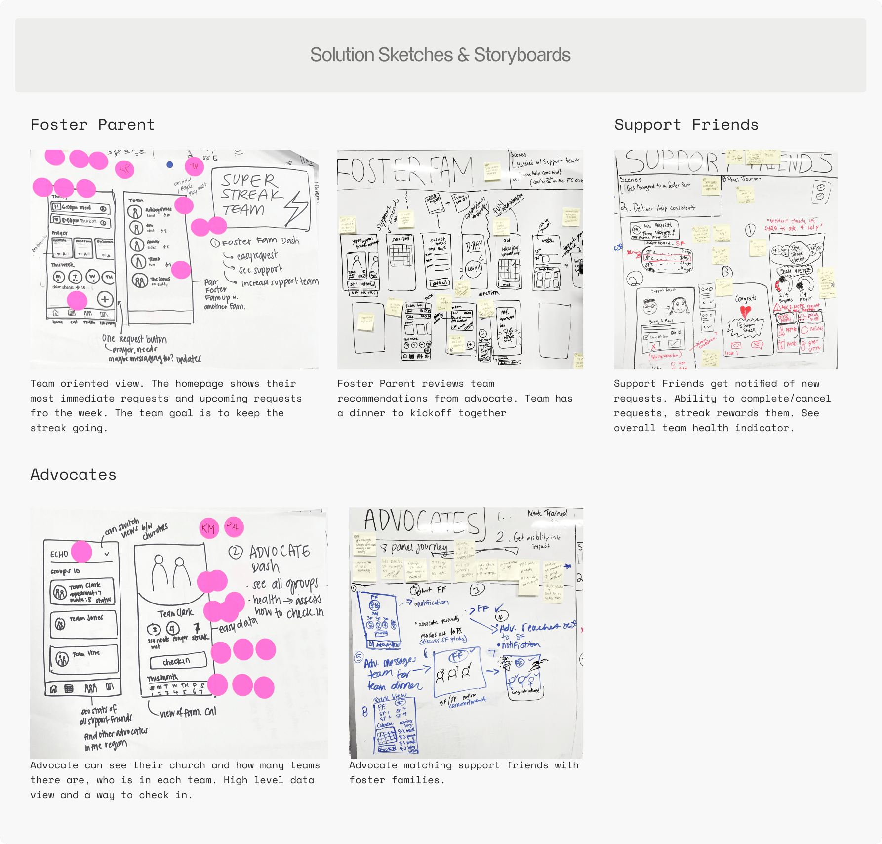
Solution Sketching
We kicked off the project with a design sprint with the Foster the City team. I planned and facilitated the workshops for 2 days, 5 hours each.
Foster the City came to us asking for an app where foster parents could make requests and message their support friends and advocate directly.
Going into this, based off of our conversations with the client, our assumptions were...
1. that the most important user is the foster parent and making sure their needs are met
2. that FTC oversaw every church actively
3. that FTC already had efficient and streamlined processes in place
Through background research and user interviews, we unpacked the problem more specifically.


Key Findings &
Our Personas
User interviews with Foster the City staff and volunteers to understand the problems, needs and opportunities for each persona.
These interviews helped us diagnose the actual problems that FTC was experiencing that was driving them to build their own app.


HMWs unto greater trust and accountability
Generating HMW questions and voting on them led us to discover that the core AHA moment each persona needed to experience was Trust and Accountability.
We had to think about how we could accomplish this for each persona.


Deciding on the
Focus
We started sketching out ideas. Everyone came up with different ideas for each persona and we realized the problem space was too broad.
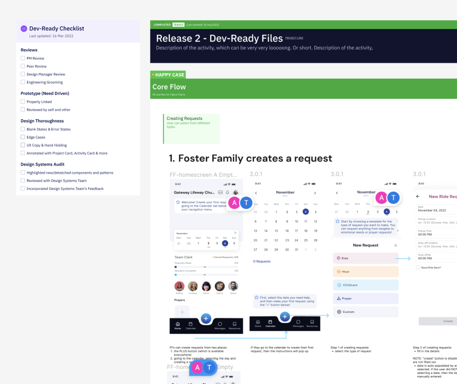
After voting and creating a list of features, we divided this project into 2 parts. The first would be the P1s, focused around calendar requests—creating requests, editing requests, accepting requests, fulfilling requests.

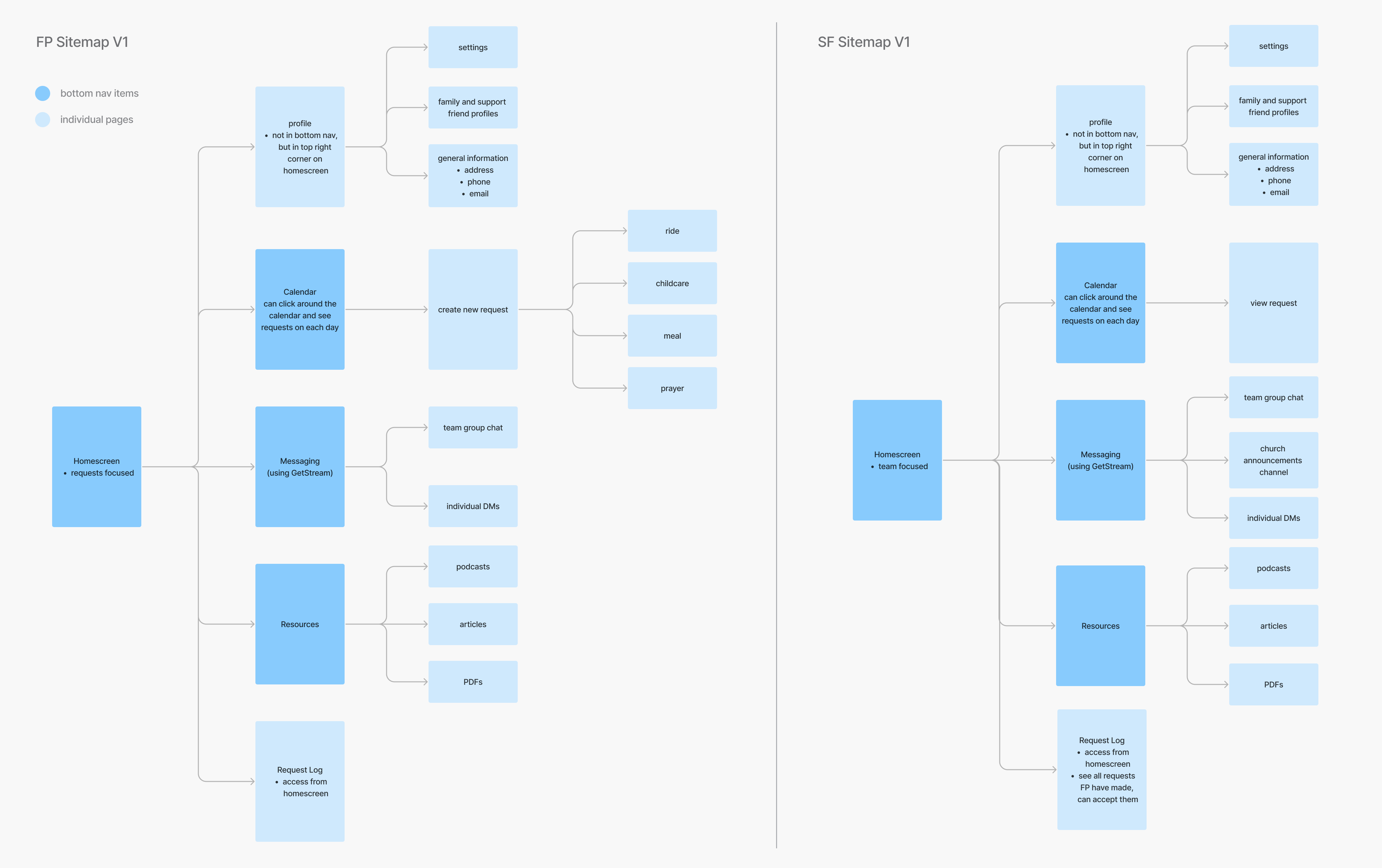
Flows and Sitemap
The sprint helped us gain high-level focus on what we wanted to work on, but we still had to distill the specific flows more.
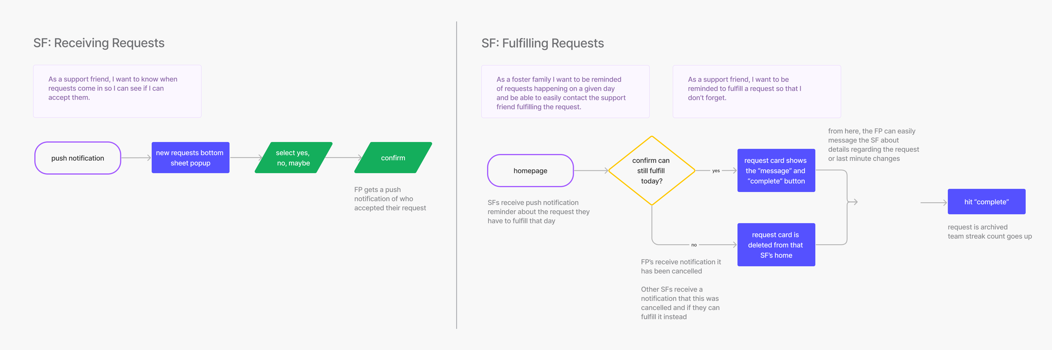
I created a first time FP user flow and the key task flows to demonstrate how sending and receiving requests would work.

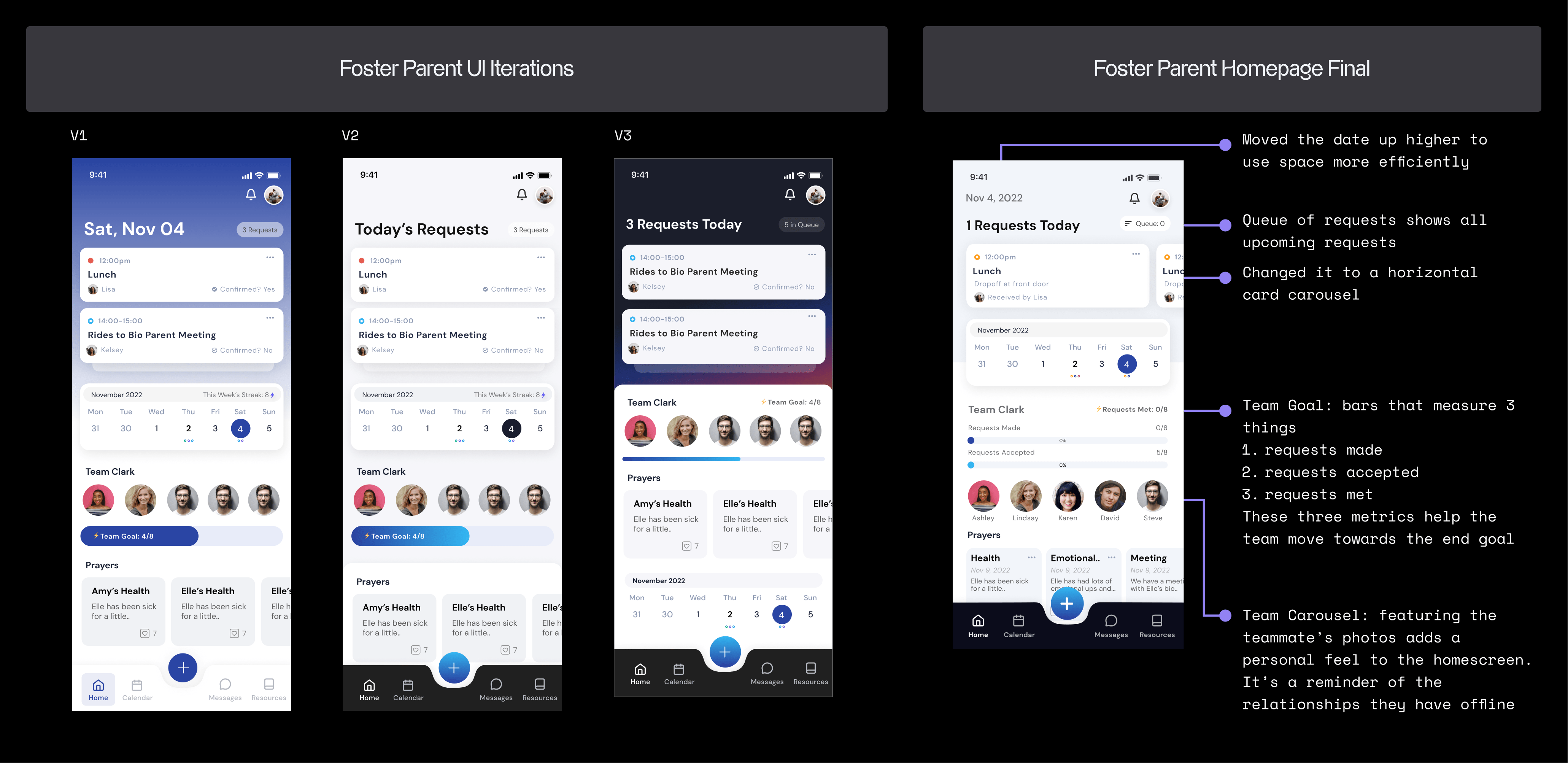
FP: Homescreen & Requests
2 Iterations
Foster Parents are busy people and often feel overwhelmed. My goals in designing the homescreen was to make it calm and show the most important info on top, which was the requests. From there, I made 2 iterations.
The biggest takeaway was feedback from Foster the City: that the designs looked too sterile and we needed to bring back the human, relational side of it.


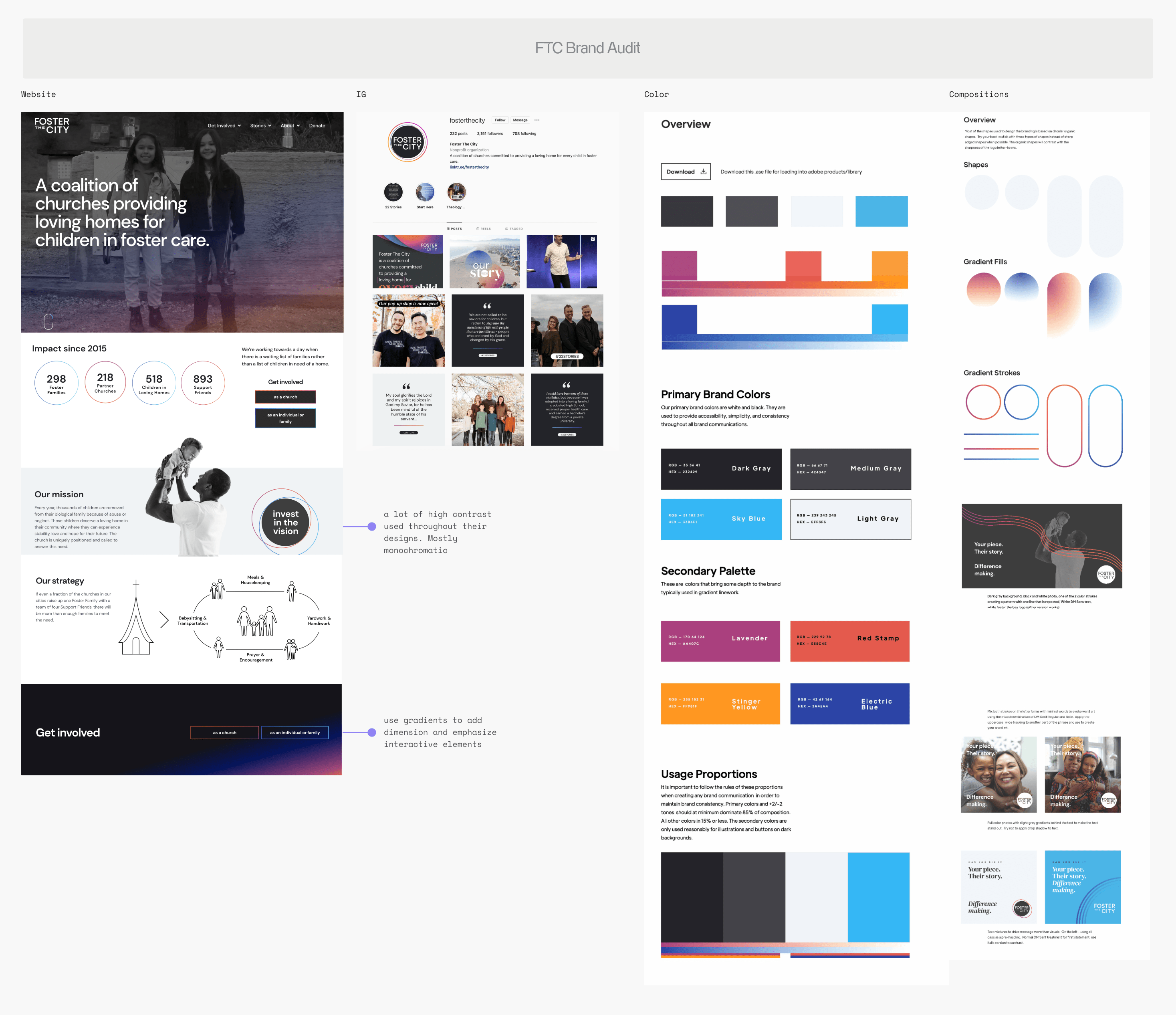
Stepping Back: Can we change the UI colors?
I started doing more refined explorations. I chose the UI colors in the screens above based off of the FTC brand, but lightened the colors to create a soothing, calming app experience for users.
Foster the City wanted it to align more directly with their brand. They were extra mindful of staying away from pastels so that it wouldn't look too "feminine," since most people in foster care are women.
I went back to review their brand and assets, and translated that to 3 UI options. I reviewed this new palette with their internal creative director. I also added the profile pictures of the whole support team onto the homepage.

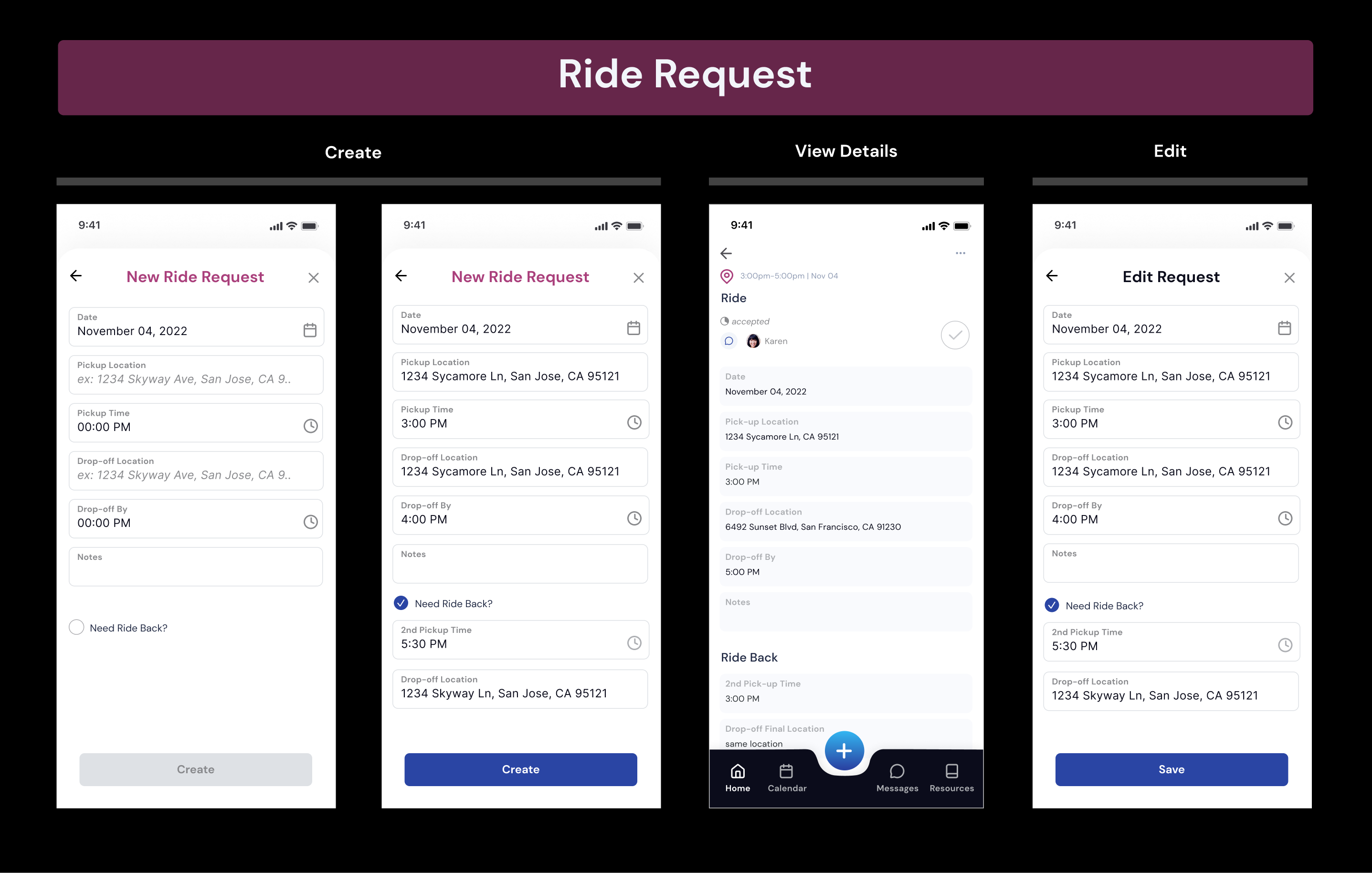
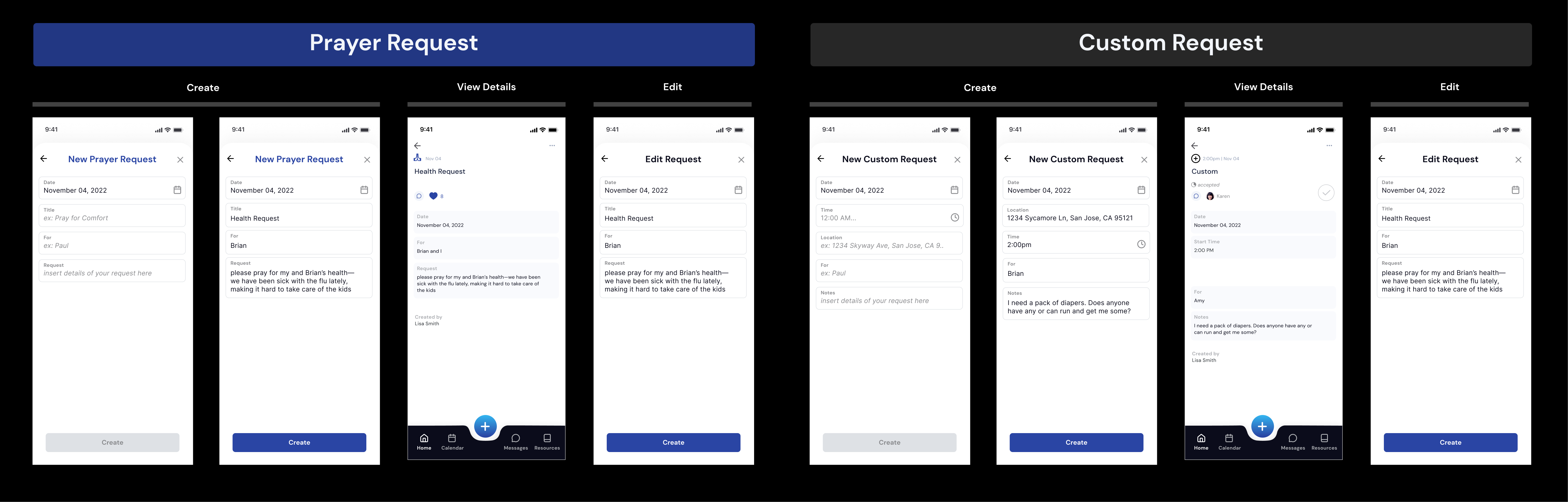
Request Card Refinement
It turned out that requests were a lot more complex than we thought. I had to revisit thinking about:
What would the FP or SF need to know immediately when they look at a request?
How can we group items on the request cards?
I also realized every request needed to have a status and the actions for FPs and SFs would change per status.


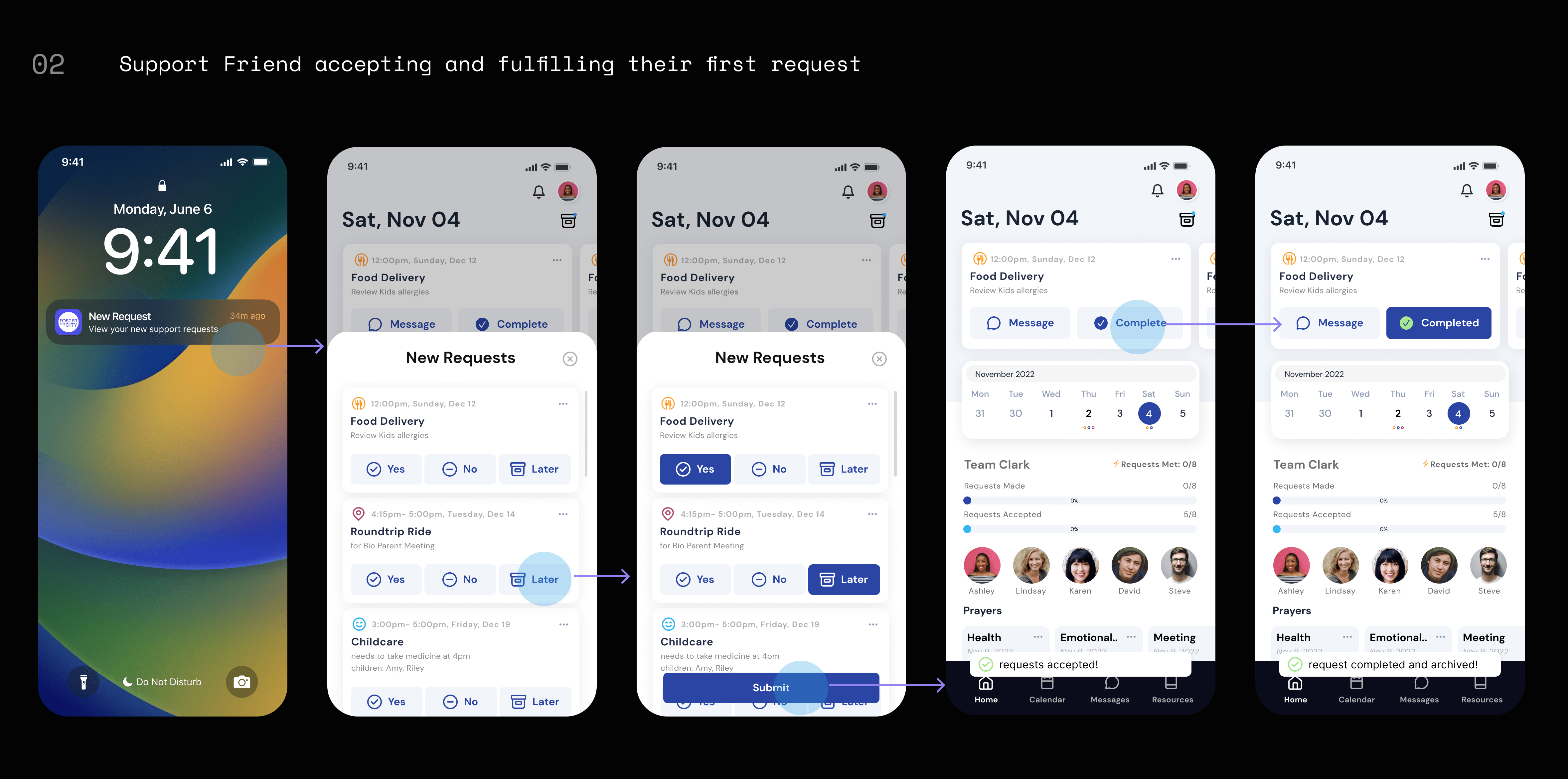
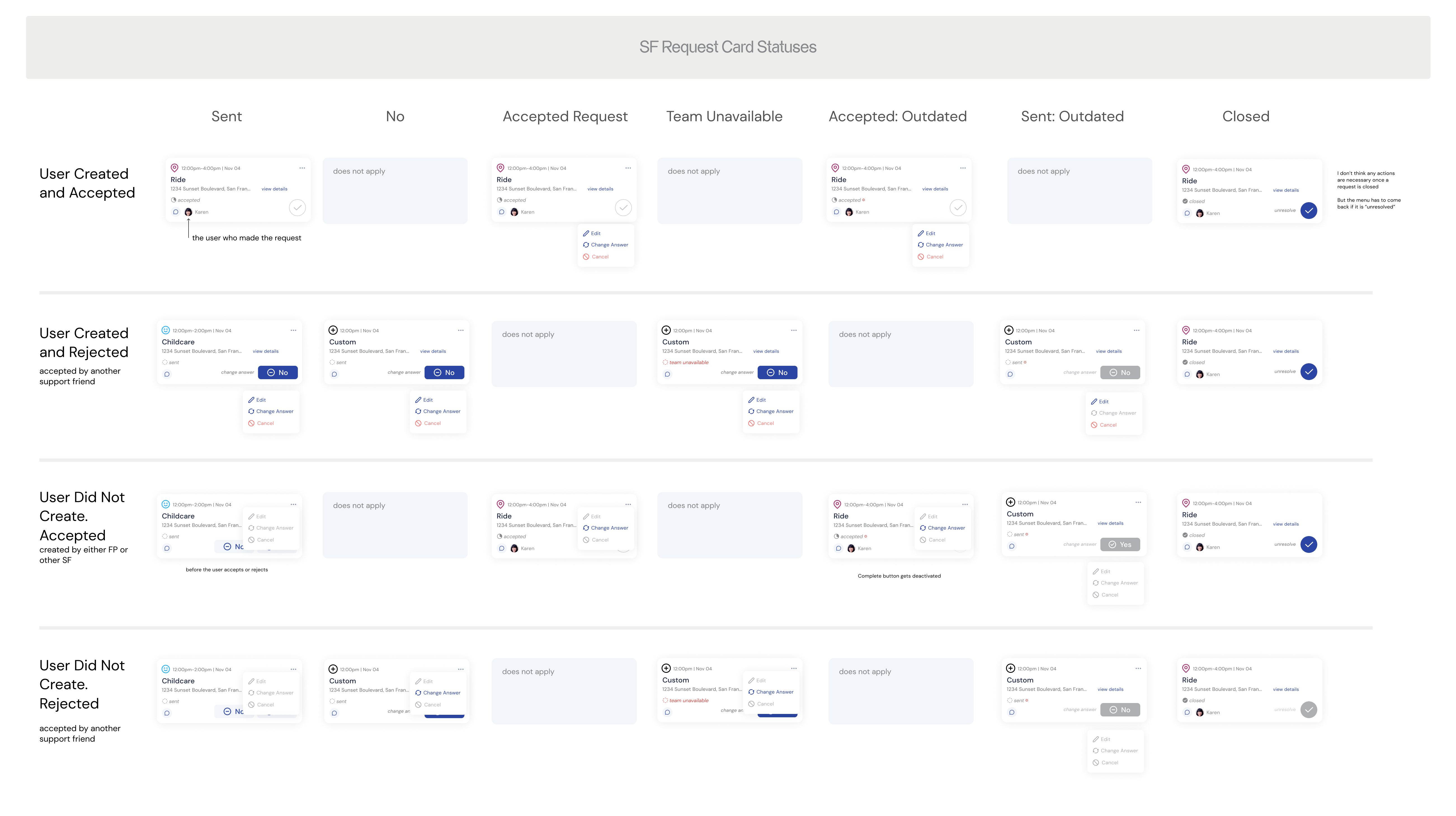
SF Request Cards
User feedback told us that SFs also needed to be able to create requests based off of the FP, so I had to think through that extra functionality and how that is different from the FP side.
I charted out every status and case the request cards could be on the SF side to make it extra clear for engineers. The product manager from Yalantis collaborated with me to catch all the details.
The Final Design ✨
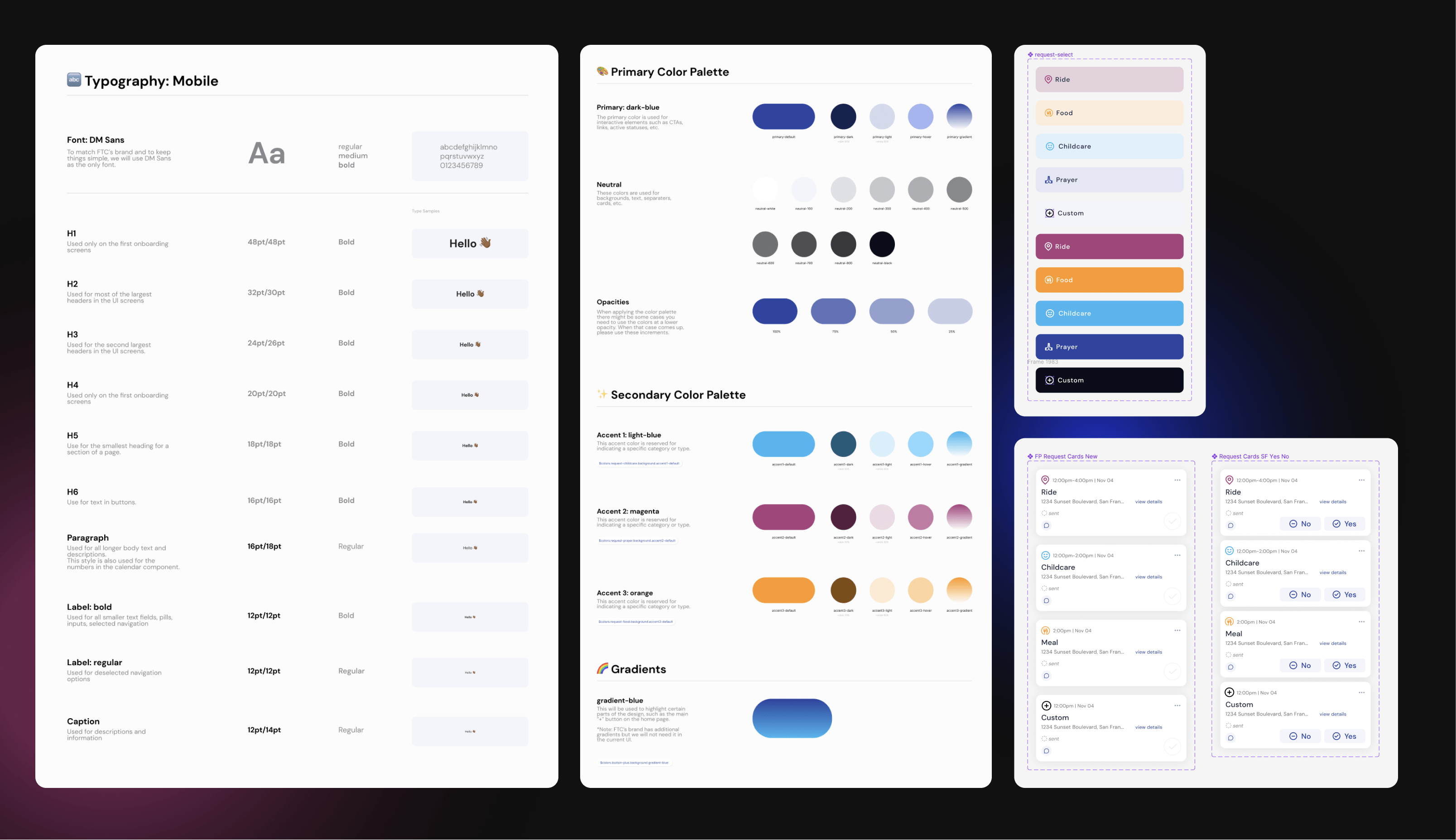
Design System
Refined Calendar Request Feature
After setting the new UI style and colors, I documented the decisions as the design system to ensure consistency in design and development.

Learnings
01
Bring visuals when sharing ideas with cross-functional partners.
By sharing low-fidelity explorations and visual references earlier on in the process and inviting engineers to review and give me feedback, I could communicate my designs more clearly and increase collaboration with my team. It's my job to not only design screens but also make sure my team can understand them as easily as possible.
02
Defining clear requirements, doing discovery, and setting expectations early on.
The whole team has to be working towards the same goals and there can't be any confusion on what we are shipping at the end of the day. Once designs are handed off, that's it for that version and new refinements and iterations have to be kept for next time.
03
Adapt the tools to the team.
There's no use in forcing your team to use a tool that isn't working for them. Adapt the tools to your team and lean in to the ways your teammates like to work and collaborate.
Extras Behind-The-Scenes
Because there's always way more than what can fit in a lil' case study.
Clean Figma Files: As I worked through this project, I refined my figma file structure with clear pages for Engineers and critiques.

V0 Zoom Kickoff in April 2023! Such a milestone, but unfortunately we lost momentup with our testers and they didn't leave us feedback. We ended up testing internally with Foster the City volunteers and staff.

Capturing Bugs 🐛: We used Instabug as our primary way of QA to easily log crashes, bugs, and UI fixes

Notion PRDs: My first stab at writing feature PRDs. You can see how we struggled with scope creep 😬
timothea wang
is serving at Foster the City as Director of Product and at Salt+Light as Co-Lead Designer.
timothea.wang@gmail.com
linkedin.com/in/timothea
© Timothea Wang 2023 | Based remotely in Davis, CA  | Last updated: Jul 2023